MDmetrix Reveals Which States Have Flattened the COVID-19 Death Curve
Control Charts Best Method to Identify Real Improvements
MDmetrix, a clinical performance management platform, announced it has developed new control charts that project daily deaths from COVID-19 nationally and by state. The new charts show whether states are successfully flattening the “daily deaths” curve, using data on reported COVID-19 deaths from The New York Times. The MDmetrix charts are updated following the daily release of The New York Times data, which comes from a team of NYT journalists who are actively tracking deaths due to COVID-19 based on their research from numerous data sources.

The MDmetrix Mission Control platform uses control charts to help clinicians visualize outcomes across patients and to separate data “signals” from “noise.” Leveraging decades of quality improvement science, MDmetrix’s control charts enable clinicians to determine whether an ongoing process or system is “stable” and predictable or has meaningfully changed.
Recommended AI News: TurboTax to Help Millions of Americans Get Their Stimulus Payments With Launch of Free Stimulus Registration Product
By applying control charts to the COVID-19 epidemic, MDmetrix’s visualizations indicate whether COVID-19 deaths are continuing to rise on an exponential path nationally and on a state-by-state basis. While particular day-by-day data points will vary (data noise), MDmetrix’s charts show whether there is material evidence of a change in direction—i.e., whether there is a real data signal that a state has “flattened the curve.”
“The MDmetrix Mission Control platform provides control charts that help healthcare professionals visualize and identify significant clinical changes,” said Warren Ratliff, chief executive officer of MDmetrix. “With COVID-19, the public needs to see the urgency of mitigation measures. We are sharing this powerful tool to allow everyone to understand, visually, the critical need to comply with social distancing and other mitigation measures.”
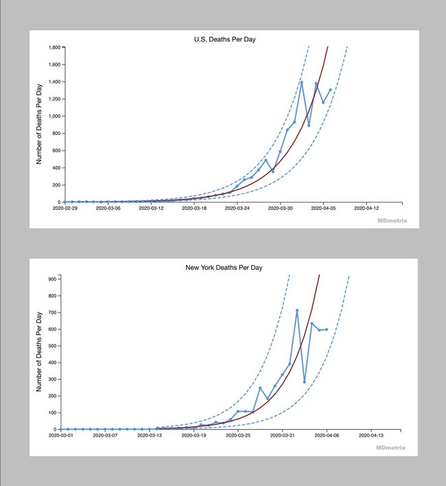
Nationally, MDmetrix’s charts show that the United States’ daily deaths are on an exponential growth curve. Highlights from recent data for the states with the highest number of total deaths include:
- New York state’s daily deaths are still on an exponential growth curve.
- New Jersey’s daily deaths are still on an exponential growth curve.
- California’s daily deaths are still on an exponential growth curve.
- Michigan’s daily deaths are still on an exponential growth curve.
- Louisiana’s daily deaths are still on an exponential growth curve.
- Washington state’s daily deaths are still on an exponential growth curve.
Recommended AI News: How Much Artificial Intelligence Has Changed The Forex Trade
“It’s essential that we sift real data signals from random noise, so that we focus on what matters as we fight COVID-19,” said Dan Low, MD, associate professor at the University of Washington and chief medical officer of MDmetrix. “Control charts are the best tool for distinguishing signals from noise in real-world medical data.”
The MDmetrix charts were developed based on methodology from Lloyd Provost, a leader in the application of control charts for healthcare improvement. Provost, a statistician with Associates in Process Improvement and senior fellow of the Institute for Healthcare Improvement (IHI), is an advisor to MDmetrix. Provost is also the co-author of the seminal text in this field, the Healthcare Data Guide, and has been a sought-after teacher, thinker and consultant for decades. Provost worked with colleagues Rocco Perla and Shannon Provost to apply the control chart method to COVID-19 daily reported death data.
“A special cause signal below the lower limit on these charts will show that we have succeeded in flattening the curve of COVID-19,” Provost said. “As of today, we have not seen a data signal that the U.S. as a whole has successfully reduced the accelerating daily death rates from this disease. The worst affected states, including New York, New Jersey, California, Michigan, Louisiana and Washington state, also have not flattened the daily death curve.”
Provost added: “MDmetrix has revolutionized healthcare quality improvement by making it easy for clinicians and leaders to deploy the best healthcare improvement methods to guide both policy-making and frontline clinical operations. Now that they are applying these methods to the COVID-19 deaths, everyone can monitor the effectiveness of mitigation efforts as we fight this deadly disease—together.”
Recommended AI News: Automation Provides A Content Lifeline For Remote Work
MDmetrix explains how to read the control charts:
- The red line represents an exponential growth curve projection, based on available daily deaths data from the New York Times.
- The solid blue dots, joined by the blue line, represent the actual number of reported COVID-19 deaths per day.
- The dotted lines are “control limits” that are mathematically tied to the projected growth rate. If COVID-19 deaths are on a “stable” path of exponential growth, then the solid blue line should stay within the dotted “control limit” lines.
- Naturally, the blue line moves back and forth across the red line projection, reflecting expected real-world variation (noise).
Decades of quality improvement data science (i.e., industrial engineering) have established several rules for detecting material “signals” using control charts. For example, if the blue line (deaths) crosses a dotted line (a control limit), that would signal that something has occurred that has made the exponential growth “system” unstable. Perhaps a stay-at-home order might decelerate the daily death count, flattening the blue line and crossing the lower control limit. Or, the lifting of a stay-at-home order might accelerate the daily death count, raising the blue line and crossing the upper control limit.
Other data signals that would indicate we’ve turned the corner would be eight sequential points to the right of the red line; or six sequential points, each falling farther to the right (i.e., away from the red line). The converse of any of these rules would mean the situation is getting worse.
MDmetrix’s artificial intelligence automatically identifies “signals” in the data so that leaders and frontline clinicians can understand and adapt their approaches to COVID-19.
Recommended AI News: Factual + Foursquare Announce World’s Most-Powerful Location Engine Pairing

Comments are closed, but trackbacks and pingbacks are open.